Incorporating Accessibility in a Nonprofit Website: A Case Study

Website accessibility is “designing and developing websites, tools, and technologies so that people with disabilities can access them.” It matters because it is a legal obligation and helps format website content to be more accessible to crawlers and users. Increased accessibility can result in all users being able to navigate and interact with the site. Assistive technology (AT) depends on code signals that control the context of what search engines crawl. Accessibility covers visual, auditory, physical, speech, cognitive, learning, and neurological disabilities. It helps users read smaller screen sizes and those with slower internet connections. Most accessibility features relate to SEO-related ranking elements—anchor text, ALT text, headings, and page titles (Pawar, 2022).
Evaluating a Website’s Accessibility
Figure 1
Screenshot of the desktop Accessibility score for the homepage of Christian Growth Resources
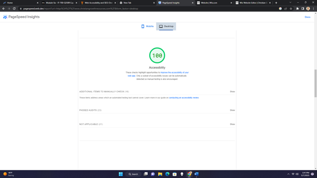
Figure 2
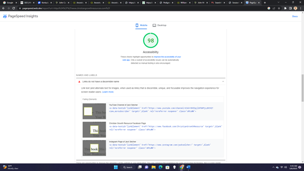
Screenshot of the mobile Accessibility of the homepage of Christian Growth Resources
I used PageSpeed Insights to determine coverage of accessibility issues of the desktop and mobile homepages of Christian Growth Resources, a nonprofit organization. The founder of the site relies on Wix Website Builder to maintain it.
- The desktop version of the homepage passed all the Accessibility audits (100 percent score) on PageSpeed Insights, as shown in Figure 1. To help achieve this score, I added alternate text to the social media icons in the desktop version.
- The mobile version of the homepage scored ninety-eight percent, as shown in Figure 2 (PageSpeed Insights, 2023). This less-than-perfect mobile version score was because the three social media icons in the footer needed link text. However, the Wix Website Builder program at the time did not allow users to set the link text for social media icons in the mobile version, which was a fault in the program.
According to the Worldwide Web Consortium (W3C), accessibility incorporates the following four principles:
- Users must have access to information and interface components that offer them methods they can perceive, such as text alternatives for non-text content and contrasting foreground and background.
- Users must have practical user interface components so that keyboards can operate all functions and websites have operable navigation.
- Users must have access to an understandable and operable user interface, including readable text content and predictable web page appearance and behavior.
- Users must have rich content that assistive technology and other user agents can reliably interpret.
Website accessibility often overlaps with website performance. Thus, improving accessibility results in better performance. Search engine guidelines incorporate SEO and performance guidelines to improve user experience, accessibility, and performance, including using headings, incorporating ALT text, selecting descriptive anchor text, creating on-site sitemaps, defining straightforward website navigation, and improving readability.
Including ALT Text
ALT text helps describe images in words for screen readers and when images do not load. Therefore, “the alternate text has to be accurate and relevant to the image and not just many keywords stuffed to help the bots.” ALT text transverses into SEO when
used for more traffic and click-throughs due to image searches. Christian Growth Resources has ALT text for all images on the website, blog, and social media icons (desktop version only).
Selecting Descriptive Anchor Text
Figure 3
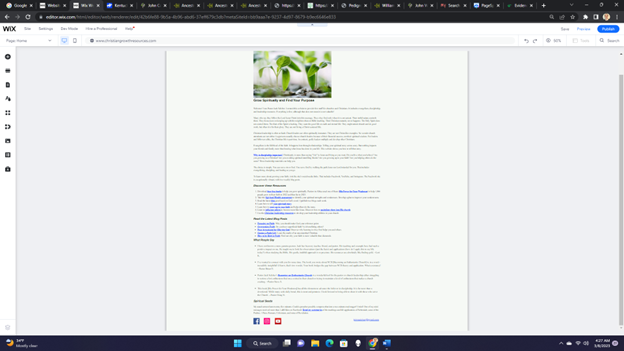
Screenshot of the Homepage showing Anchor Text
Anchor text is the descriptive text in the content that duplicates as a link. It allows the web designer to incorporate keywords, describe a page’s content that links with it, and detail its purpose. Anchor text allows links to appear naturally in the content instead of an insistent “click here.” It can detail page content with which it links, describe its purpose, and incorporate keywords. Many of the web pages contain anchor text. For example, Figure 3 shows the anchor text on the homepage. I used anchor text to highlight some of the most critical parts of the website.
Headings
Headings “communicate the organization of the content on the page.” In accessibility terms, plugins, assistive technologies, and web browsers can use headings to offer in-page navigation. The initial site audit showed that Christian Growth Resources had no headings. I created styles for six headings (H1-H6). Each page only had one H1 heading—the title of the page. Headings help organize text passages, so in most situations, headings appear in chronological order (W3C, 2023).
Making On-site Sitemaps
Making on-site sitemaps can assist search engine crawlers in accessing a site. The sitemap outlines every file and page on the website and assists users in navigating through the website and locating relevant content. With “web accessibility in mind, the on-site sitemaps help provide an overview and clear navigation to all the pages on the site” (Pawar, 2022).
Wix Website Builder automatically optimizes the sitemap index to follow best practices, which include individual sitemaps. The program creates individual XML sitemaps automatically for every web page type. An XML sitemap index organizes all the individual sitemaps into a format that search engines can easily crawl. The sitemaps update instantaneously whenever a site change occurs (Wix, 2023).
Defining Clear Website Navigation
A website’s navigation helps users find what they are trying to locate. One design marker that makes a navigation menu easier is if all pages are only a few clicks deep. For instance, according to SEMrush, all the pages on Christian Growth Resources are one or two clicks deep. Also, navigation menus help “search engines and screen readers navigate through your website.” Christian Growth Resources uses a horizontal menu in the desktop version and a hamburger menu style in the mobile version.
Improving Readability and Promoting Visual Clarity
To increase readability, website designers should tailor content to the target audience. Composing the content for the target audience involves including apt headings, prominent keyword usage, and internal and external links. Another content goal is to write simply without complicated jargon. Although I did not write most of the content because the site founder is the subject expert, I did edit all the content with Grammarly to simplify it. According to SEMrush, most pages were not technically challenging; however, three pages were (including the homepage). Some of the difficulty could be due to Biblical-related words, which, although not mainstream, are essential to the content. I used SEMrush’s SEO Writing Assistant to simplify the language and decrease paragraph size. I improved the readability of most of the site’s pages through these methods.
The content and website elements need visual clarity.
- I made all the content left justified (Pawar, 2022).
- One readability issue I had to fix more than once was the background and foreground colors having a sufficient contrast ratio. First, the font and background colors needed more contrast on some green buttons with off-white font colors. To increase the contrast, I changed the button color to deep brown and the font color to white. Another contrast issue occurred with the desktop version’s horizontal menu. Again, the navigation menu was green with white text. However, since the contrast was insufficient, I changed the font color to black, passing the PageSpeed Insights audit.
- I chose accessibility fonts to improve readability and contrast. Initially, the website used fonts that were not accessible and had contrast problems, according to PageSpeed Insights. Eventually, I decided on two accessible fonts: Helvetica Bold for the headings and Times New Roman for paragraphs (Site Improve, 2023).
- Another readability issue is that the document should use legible font sizes. Although the 16px Times New Roman font for the paragraphs of the desktop version was not an issue, the same font was a problem in the mobile version. I increased the mobile version’s font size to 19px, which passed PageSpeed Insights.
- Furthermore, I needed help with the size of tap targets in the mobile version. Specifically, the social media icons were too small for users to click. Based on the guidelines provided by PageSpeed Insights, I resized the social media icons to the appropriate size of 48px by 48px (PageSpeed Insights, 2023).
I explained how I integrated accessibility into a nonprofit website. Using PageSpeed Insights as a measuring stick, I adapted various website elements to meet accessibility standards. I included alternate text, anchor text, on-site sitemaps, straightforward navigation, well-defined visual elements, and simpler content. Some issues I addressed include improperly sized tap targets, inappropriately sized fonts, insufficient contrast between the foreground and background colors, and a need for link text in the mobile version.
References
PageSpeed Insights. (2023). The mobile version of christiangrowthresources.com. https://pagespeed.web.dev/report?url=https%3A%2F%2Fwww.christiangrowthresources.com%2F
Pawar, S. (2022, May 12). Web accessibility and SEO: A beginner’s guide. WP Rocket. https://wp-rocket.me/blog/web-accessibility-seo/
Site Improve. (2023). How to choose a font for accessibility. https://www.siteimprove.com/glossary/accessible-fonts/#:~:text=The%20most%20accessible%20fonts%20are,rather%20than%20the%20body%20text
W3C. (2023). Headings. Design and Develop. https://www.w3.org/WAI/tutorials/page-structure/headings/
Wix. (2023). Sitemaps. https://manage.wix.com/dashboard/bb9aaa7e-9237-4d97-8679-b9ec6646e833/seo-home/sitemap?referralInfo=seo-home
