Know Your Tech Terms: Wireframes

Black and white depictions of wireframes on various mobile devices

A wireframe serves as the blueprint of website design. It shows the features and navigation of a website and overviews the “site’s functionality before considering visual design elements, like content and color schemes.” Wireframes consider navigation elements like buttons and menus (Osman, 2021). They establish relationships among the site’s different templates. Primarily, a wireframe focuses on expected behaviors, functionalities, content prioritization, and space allocation. Therefore, wireframes do not typically show graphics, color, or styling. Production methods of wireframes range from digitally drawn images to paper sketches. Hence, their details vary (Usability.gov, 2022).

When designing a website, wireframes show how a website’s layout enhances user experience. Wireframes help make the design relevant to users. It is the way to bridge the gap between design and conversions. A wireframe lets you “test drive the page layout and evaluate user flows to see how the new website will function and find any potential mistakes that might eventually get in the way of conversions” (Osman, 2021).

Imagine wireframes as your guide to a new website. They show you the site’s major content and navigation elements. Wireframes are simple in design, usually black-and-white, two-dimensional, substitute gray tones for color, and use one generic font (in multiple sizes). They are straightforward because they do not focus on visual design. For example, a rectangular box with an “X” through it represents an image. Common elements included in wireframes are logos, search fields, breadcrumbs, headers, navigation systems, share buttons, body content, and contact information. We can make wireframes for a variety of devices. For example, Figure 1 shows a wireframe of the first webpage in the login process in a smartphone format.

Figure 1

Mobile Wireframe Example
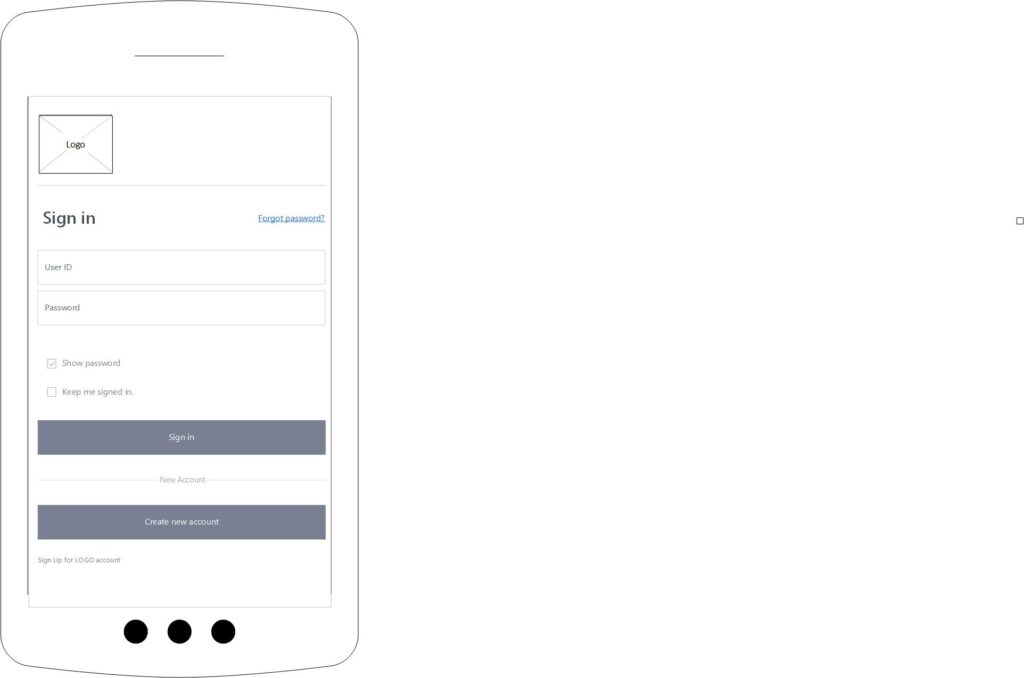
A black and white wireframe of a smartphone screen

Wireframes range from low fidelity to high fidelity. Website design teams often quickly sketch low-fidelity wireframes since they ease project team communication. These types of wireframes usually are more abstract because of their simplicity. They tend to include Latin filler text for labels and content. In contrast, high-fidelity wireframes are more detailed and are good for documentation. They are better at showing interactive elements than low-fidelity wireframes because they include page element information on dimensions, behaviors, and actions (Usability.gov, 2022).

Why should you use wireframes? Web designers make wireframes for several reasons, but the “most important is that it enables you to identify and take every opportunity to improve your site’s functionality, ease of use, and convenience in order to delight your users.” The design team can use wireframes to collaborate and get user feedback during the design process. Web designers can use wireframes to improve website design through user input (Osman, 2021).

Benefits of Wireframes

Wireframes

Wireframes help web designers in many ways before the design process.

  • They help clarify the structure of the website. They turn abstract thoughts into tangible ideas. They help keep the development team on the same page.
  •  They outline the website’s features using nonprofessional terms instead of technical jargon. Wireframes provide “clear communication to a client how these features will function, where they will appear on the specific page, and how useful they might actually be.”
  • They emphasize usability by optimizing page layout, feature placement, and ease of use.
  • They enhance navigation decisions. For instance, using website wireframes lets users test the new website design. They will review several elements. Does the navigation allow them to reach their destination easily? Do breadcrumbs help or hurt? Is the navigation intuitive?
  • They foster an iterative design process. They break up the layout parts of the website, including functionality, branding, creativity, and layout into different steps. This division lets everyone involved in creating the new website provide feedback early in the design process. Avoiding wireframes altogether “delays this feedback and increases the costs of making changes because full design mock-ups must be reworked, not just simplified wireframes.”
  • They save effort and time by allowing for a more carefully considered design and a more informed development team. With clearer content creation, wireframes simplify communication and prevent misunderstandings. Best of all, “everyone from the development team, the agency, and the client are all on the same page about what the interface is supposed to do and how it is supposed to function.”
  • Wireframes improve the effectiveness of content development. Your website content must be straightforward, timely, and relevant. Since most visitors do not like to read long clunky blocks of text, we include numbered lists, bullets, heads, and fonts to create an aesthetically pleasing arrangement. Wireframing allows us to “figure out the optimal font size, head position, and content quantity by trying different options.” Finding the best formatting schemes increases your website’s persuasiveness and readability (Lynch, 2022).

References

Lynch, A. (2022, February 11). Benefits of wireframes—Reasons to use wireframes. Edraw. https://www.edrawsoft.com/benefits-of-wireframe.html

Osman, M. (2021, August 25). Website wireframe beginner’s guide: Processes, tools, and examples. HubSpot. https://blog.hubspot.com/website/website-wireframe#:~:text=What%20is%20a%20website%20wireframelike%20content%20and%20color%20schemes

Usability.gov. (2022, June 8). Wireframing. U.S. General Services Administration. https://www.usability.gov/how-to-and-tools/methods/wireframing.html

Know Your Tech Terms: Responsive Website Design

A web designer with different wireframes on different devices supposedly representing responsive website design

What is responsive website design? Unlike static websites which appear the same on any screen size, responsive websites use CSS and HTML to automatically adapt websites to the screen widths and viewports of various devices (including desktops, tablets, and smartphones). A responsive website uses CSS to readjust images and text, and media queries to apply different styling based on browser sizes (W3Schools, 2022). Web designers can use responsive web design frameworks to ease the design process.

A computer screen with code and the word, "Bootstrap" highlighted at the top.

An example of a responsive website is Bite Toothpaste Bits. The website sells sustainable, plastic-free personal care products like bamboo toothbrushes and toothpaste bits. The website is an example of responsive web design, According to Aigars Silkalns, the website uses the responsive web design framework, Bootstrap (Silkalns, 2021). The source code backs this conclusion because it mentions Bootstrap several times.

Bootstrap is one of the most popular responsive web design CSS frameworks. It incorporates HTML, CSS, and jQuery to create responsive webpages (W3Schools, 2022). Web designers adapt existing Bootstrap templates. Using a framework like Bootstrap guarantees that web designers can build a website according to the specifications of responsive web design.

The Bootstrap framework, Bite Toothpaste Bits, has several responsive web design characteristics.

  • The most elementary component of Bootstrap is the grid. The grid defines the width of every HTML component occurring on the webpage. The grid divides the webpage into twelve equal columns and lets elements occupy one to three columns. Splitting the website into equal sections, the website is easily adaptable to different screen sizes. (Maina, 2017). Many product pages on the Bite Toothpaste Bits website are “arrayed in grids with stunning hover effects” (Silkalns, 2021).
  • Bootstrap uses responsive web design to modify a website to different screen sizes. In total, the framework uses four different resolution constraints (specifically the horizontal widths): large (1200 pixels), medium (992 pixels), small (768 pixels), and extra small (less than 768 pixels) (Maina, 2017). Using Google Chrome Develop Tools, I entered these different widths. As expected, the website easily adapted to any of these widths. Furthermore, I used the various screen sizes built into the application to view the website, including smartphone-sized screens smaller than 768 pixels. For example, I used the dimensions of the iPhone Pro 12 to evaluate the website. Again, the website’s responsive design allowed it to conform to any of these resolutions.
  • Responsive web design involves setting the viewport, “which will give the browser instructions on how to control the page’s dimensions and scaling.” To set the viewport, web designers include a <meta> tag, <meta name=”viewport” content=”width=device-width,initial-scale=1″> (W3Schools, 2022). I found this code in the website’s source code (Bite Toothpaste Bits, 2022).
  • Responsive websites use responsive images “that scale nicely to fit any browser window.” This process involves setting the CSS max-width property to 100%. This alteration allows the image to scale upwards and downwards (W3Schools, 2022). Google Developer Tools show that the website’s images scale to different device sizes.
  • Bootstrap allows for responsive text size. Developers can set the text size with the “vw” or “viewport width” unit. Text scales based on the browser window’s size. The website includes the “vw” code several times in its source code (W3Schools, 2022). Changing the screen sizes in Google Developer Tools reinforces the website’s responsive text size.
  • Bootstrap-based websites have a responsive navigation bar as well. Typically, Bootstrap collapses the navigation bar when the screen size shrinks to less than 768 pixels. The web view “contains all of the navigation links aligned horizontally across the page, while as the mobile view is more compact and makes use of a navigation icon which when clicked displays the navigation links aligned vertically.” Bootstrap has a special class called “navbar” that it uses to create this effect (Maina, 2017). Like other Bootstrap websites, the Bite Toothpaste Bits website has a horizontal menu at first until the screen width is less than 768 pixels when the horizontal menu morphs into a vertical one.

I used different browsers to view the example website. First, I looked at the homepage with Google Chrome on my desktop computer. The site design easily filled the layout space with no element cutoff. Notably, in this format, the website has five navigation tiles in the header section along with the Bite logo. The website’s responsive web design changes in several smaller screen sizes. Second, I used another browser, Microsoft Edge, to analyze any differences from Google Chrome. The website looks identical in its desktop format to Google Chrome. Then I used Microsoft Developer Tools to assess the same screen sizes as in Microsoft Chrome. Again, the website’s responsive web design adapted beautifully to each iteration.

References

Bite Toothpaste Bits. (2022). Bite. https://bitetoothpastebits.com/

Maina, D. (2017, July 26). Responsive web design with Bootstrap. Medium. https://medium.com/@duncandevs/responsive-web-design-with-bootstrap-70147ecd9d98

Silkalns, A. (2021, December 29). Twenty Bootstrap websites inspiration to build fresh and innovative design 2022. Color Lib. https://colorlib.com/wp/bootstrap-websites/

W3Schools. (2022). HTML responsive web design. https://www.w3schools.com/html/html_responsive.asp

Know Your Tech Terms: Cascading Style Sheets (CSS)

Code on a computer screen with the word, "CSS" highlighted

CSS is the shortened form of Cascading Style Sheets. This web language arose after developers could not adapt HTML to stylize large websites. Since CSS is a distinct web language, its syntax differs from HTML 5. Users can stylize CSS as external style sheets, inline styles, and internal styles. CSS affects the positioning of website elements, including fonts and colors.

CSS defines the display of HTML elements. Before the introduction of CSS, web developers needed to code tags for fonts and colors repeatedly on every webpage. Thus, coding many descriptive tags on a large website created a nightmare. Therefore, the World Wide Web Consortium (W3C) developed CSS to alleviate the issue (“CSS Introduction”).

Furthermore, the syntax for CSS differs from HTML. Developers should signify the style type use of CSS in the head section. This notation will inform the document’s use of CSS (AGI Creative Team 41). CSS code splits into several distinct sections. For example, a developer might write:

h2 {

            color: black;

}

The first component, the selector, denotes the stylized part of the HTML. For this example, the selector is h2. More specialized selectors commonly used include the class selector and ID selector. The declaration is the second part which features the given styles. In this example, the declaration is “color: black.” Furthermore, the declaration divides into a property: value pair. In the example, color is the property while black is the value (Schmitt 25). However, many web designers do not use these technical terms daily (AGI Creative Team 40).

Ultimately, developers can code CSS in three ways. First, developers can create an external style sheet document that links to an attached file with a CSS extension. This file allows developers to include all the CSS styles for a website. This style sheet type is the only CSS styling method used on multiple web pages (AGI Creative Team 45). Sometimes developers add numerous external CSS files that categorize CSS styles in separate documents. Secondly, developers can use internal styles that integrate a webpage’s styles in the head section. These styles only affect the webpage where the embedded styles appear. Internal styles can be useful for changing styles by overriding inline and external styles. Lastly, developers can use inline styles by directly entering the HTML code. Examples of inline elements include img or em (Schmitt 29, 31). Typically, developers use internal and external styles (AGI Creative Team 45-46).

CSS affects the positioning of website elements in a browser in four ways: static, fixed, relative, and absolute. First, the static position, or normal flow of the document, involves vertically stacking each block-level element on top of the next block-level element. Secondly, elements in the fixed position remain in the same location relative to the browser window. Thirdly, in the relative position, given position properties of top, right, bottom, and left offset the relevant element from the static position (Schmitt 38-39). Lastly, elements in the absolute position follow the positioning values of their containers.

CSS stylizes many elements in a website. Fonts and colors are some of the most stylized elements. CSS organizes colors into two main color systems, with each color holding a different value in each system. The RGB system arranges colors according to how much red, green, and blue are in each color. The hexadecimal system categorizes each color in a six-character code headed by a pound sign. Developers can use either system (AGI Creative Team 43, 131). Fonts come in five font family types which each include multiple fonts. These font families include serif fonts, sans fonts, cursive fonts, fantasy fonts, and monospace fonts. Developers can assign different font families to stylize headings and paragraphs (Schmitt 44).

Finally, the importance of CSS in building websites is immense. CSS provides the visual framework for a website in a browser. The most recent version, CSS 3, covers such varied aspects as positioning, layout, typography, and color selection. Properly applied, CSS can successfully launch a visually engaging website.

References

“CSS Introduction.” w3schools.com, https://www.w3schools.com/css/css_intro.asp.

AGI Creative Team. HTML 5 Digital Classroom. Wiley, 2014.

Schmitt, Christopher. Designing Web and Mobile Graphics. New Riders, 2013.

Launching My First Website: A Lesson in Humility

A gravestone with "GeoCities" written on it surrounded by webpages

During my teenage years, GeoCities was all the rage. It was a free web-building and hosting platform filled with bright colors, pixelated images, faulty HTML, and conspicuously placed advertisements. After a couple of decades, it finally rested in peace in 2019.

Screenshot of the homepage of the author's GeoCities website
The homepage of my GeoCities website

In the 2000s, I did not know HTML and would have thought it was an abbreviation for Hotmail, the email service. By the 2000s, when I entered the picture, GeoCities was a website builder, although fairly poorly equipped compared to today’s website builders. Without any background in coding, website creation boils down to inserting elements in place on a page like scrapbook stickers.

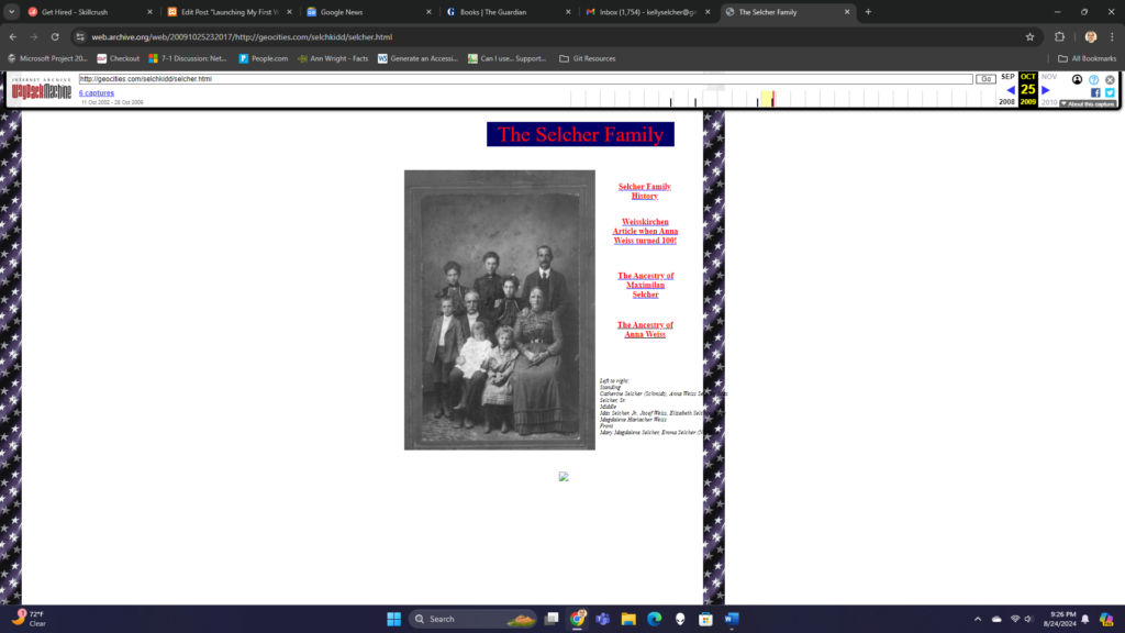
Screenshot of a GeoCities submenu page showing multiple design errors
Good luck reading the photo caption on this GeoCities submenu page

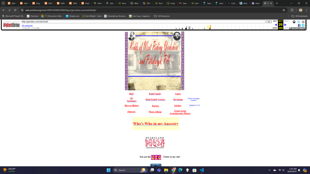
My first website, Kidds of West Riding Yorkshire and Pittsburgh, PA, devoted to my family history, showed many hallmarks of GeoCities’ outdated web design.

  • The navigation menu on the homepage included multiple dead links to web pages I intended to create but never did. Dead links also include other people’s websites that no longer exist.
  • Background images obscure some of the text. Notably in My Barker Branch, the tendrils of the vines shade parts of the text. Covered text appears again on another page with a starry banner running roughshod over text like tire tracks.
  • The same page has an image-won’t-load icon greeting visitors.
  • All the links are red, which in website-speak indicates that the linked-to webpage does not exist. In other words, with red links, I told the internet that none of my website’s links worked
A screenshot showing a malicious website has been blocked
You’ll know if your antivirus software works on Geocities.ws…or not

Finally, viewing old GeoCities websites can be dangerous. A company, Geocities.ws, has published many older GeoCities websites, but truly, it’s a scam website. If you inadvertently click on the link to an old site, you might find your antivirus software blocking access (or hopefully it does, because if you link with the site, you might soon find your computer infected with malware). The safest way to view a GeoCities website is to use Internet Archives’ Wayback Machine.